Hey there, fellow WordPress enthusiasts! Are you meticulously crafting your blog posts, pouring your heart and soul into every word, only to slap on a featured image without a second thought? If so, you’re missing a trick—a big one. The humble featured image, also known as a post thumbnail, is often the first visual impression a reader gets of your content. It’s the silent salesperson, the eye-catcher, and a crucial element in drawing people in.
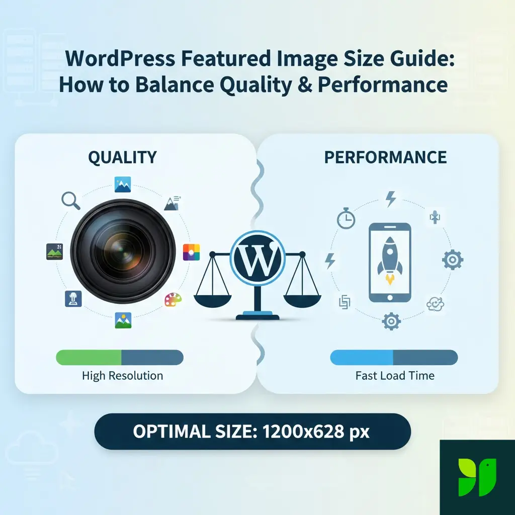
But here’s the kicker: getting it right isn’t just about choosing a pretty picture. It’s about finding that “Goldilocks” zone: an image that looks stunning on a 4K monitor but doesn’t weigh so much that it chokes a mobile user’s 4G connection. In this ultimate guide, we’re going to deep-dive into the world of WordPress featured image sizes. We’ll explore why it matters, what the “right” size really means in 2026, and how you can optimize your images like a seasoned pro.
Why Featured Image Size is a Big Deal (Bigger Than You Think!)
Before we start crunching pixels, let’s understand the stakes. This isn’t just about aesthetics; it’s about the technical health of your site.
1. User Experience (UX) and “The Need for Speed”
In an era of short attention spans, speed is everything. Google’s research shows that as page load time goes from 1 second to 3 seconds, the probability of a bounce increases by 32%. If your featured image is a 5MB monster, it’s effectively a “Keep Out” sign for users on slower connections. Beyond speed, UX is about clarity. A blurry or awkwardly cropped image makes your site look amateurish, eroding the trust you’ve worked so hard to build through your writing.
2. SEO and Core Web Vitals
Search Engine Optimization has evolved. Google now uses Core Web Vitals as a ranking factor. A key metric here is Largest Contentful Paint (LCP), which measures how long it takes for the largest element on the screen (very often your featured image!) to load. If your image is unoptimized, your LCP score drops, and so does your ranking.
3. Social Media “Link Juice”
When someone shares your post on Facebook, Twitter (X), or LinkedIn, those platforms “scrape” your site for the featured image. If your image is the wrong size or ratio, it might get cropped in a way that cuts off text or faces, making the link look unappealing in a busy social feed.
Understanding the “Right” Featured Image Size
There isn’t a single, universal “perfect” size because WordPress is a flexible ecosystem. However, we can narrow it down based on how modern themes function.
Your Theme is the Boss
Your WordPress theme defines “Image Sizes” in its code. When you upload one photo, WordPress actually creates 3–5 different versions of it (Thumbnail, Medium, Large, etc.). Your theme then calls the specific size it needs for the layout.
Full-Width Hero Themes: These require larger images, often 1920px wide, to span the entire screen.
Grid-Based Themes: If your blog looks like a Pinterest board, your “featured image” might actually only be displayed at 400px wide, even if you uploaded a giant file.
The Golden Dimensions for 2026
If you want a safe, “works-on-most-themes” size, aim for:
Width: 1200 pixels
Height: 628 pixels to 675 pixels
Aspect Ratio: 1.91:1 (Facebook standard) or 16:9 (Modern Widescreen)
Why 1200px? It’s wide enough to look sharp on most high-definition laptop screens but small enough to compress into a manageable file size (under 100kb).
The Technical Deep Dive: Aspect Ratios and Consistency
An aspect ratio is the relationship between width and height. If you use a 16:9 ratio for one post and a 4:3 ratio for the next, your blog archive page will look messy, with “staggered” boxes that disrupt the visual flow.
| Ratio | Common Use Case | Recommended Dimensions |
| 16:9 | Cinematic/Widescreen (Standard) | 1200 x 675px |
| 1.91:1 | Optimal for Social Media Sharing | 1200 x 628px |
| 4:3 | Traditional Photography | 1200 x 900px |
| 1:1 | Square (Instagram-style grids) | 1000 x 1000px |
The “Retina” Problem: Apple’s Retina displays have double the pixel density. To keep images looking “crisp” on a MacBook or iPhone, some designers recommend doubling the dimensions (e.g., uploading 2400px wide). However, for 90% of bloggers, 1200px is the better compromise for performance.
How to Find YOUR Theme’s Exact Size
Don’t guess—investigate. Here are three ways to find out what your specific theme wants:
Check the Customizer: Go to
Appearance > Customize. Many modern themes have a “Blog” or “Post Settings” section that explicitly states the recommended dimensions.The “Inspect” Trick: Open one of your published posts in Chrome. Right-click the featured image and select Inspect. Hover over the image code; a tooltip will show the “Rendered size” (what the user sees) and “Intrinsic size” (the actual file size). If your rendered size is 800px but your intrinsic size is 3000px, you are wasting a massive amount of bandwidth!
Media Settings: Check
Settings > Media. While these are the WordPress defaults, some themes override these. If you see specific numbers here that match your theme’s look, those are your targets.
Advanced Optimization: Balancing Quality and Performance
Now that we know the size, let’s talk about the weight. A 1200px image can be 1MB or 50KB depending on how you treat it.
Choose the Right Format: JPEG vs. PNG vs. WebP
JPEG: Use this for 99% of featured images. It handles photos and complex colors beautifully.
PNG: Only use this if you need a transparent background or have very simple graphics with text. PNGs are usually much “heavier.”
WebP: The gold standard. Developed by Google, WebP images are roughly 25-30% smaller than JPEGs at the same quality. Most modern WordPress versions (5.8+) support WebP natively.
Compression: The Secret Sauce
You should compress images twice:
Pre-upload: Use a tool like Adobe Express, Canva, or TinyPNG to strip out unnecessary metadata.
Post-upload: Use a WordPress plugin like ShortPixel, Imagify, or Smush. These plugins use “lossy” compression to shave off extra kilobytes without making the image look “crunchy” or pixelated.
Scaling vs. Cropping
WordPress has a built-in image editor. If you upload a vertical photo but your theme needs a horizontal one, don’t let the theme “squish” it. Use the Crop tool in the Media Library to manually select the focal point. This ensures that the most important part of your image (like a person’s face) isn’t cut off by the automated system.
Mobile Considerations: The Small Screen Challenge
In 2026, more than 60% of your traffic likely comes from mobile devices. A 1200px image is overkill for a 375px wide smartphone screen.
Luckily, WordPress uses Responsive Images (srcset). When you upload a featured image, WordPress creates several smaller versions. When a mobile user visits, their browser automatically picks the smallest version that will look good on their screen.
What you need to do: Ensure your theme supports srcset (most modern ones do). To check, inspect your image and look for the srcset attribute in the HTML. If it’s there, WordPress is doing the heavy lifting for you!
Optimization for Social Media (Open Graph)
Your featured image pulls double duty as your Open Graph (OG) image. This is the preview image that appears on Facebook or LinkedIn.
The Conflict: Your theme might want a 16:9 image, but Facebook prefers 1.91:1.
The Solution: Use an SEO plugin like Yoast SEO or Rank Math. These plugins allow you to upload a separate image specifically for social media. You can keep your 16:9 image for your blog’s aesthetic and upload a perfectly cropped 1200x628px version for Facebook.
Common Troubleshooting: “Why does my image look bad?”
Even with the best intentions, things go wrong. Here are the most common fixes:
The image is blurry: You likely uploaded an image that was smaller than the area it needed to fill. Never upscale a small image.
The colors look “off”: Ensure your images are exported in the sRGB color space. CMYK (used for printing) will look neon or dull on web browsers.
Images aren’t updating: This is usually a Caching issue. If you change a featured image but still see the old one, clear your site cache (via your hosting or plugin like WP Rocket) and your browser cache.
Thumbnails are cropped weirdly: Use a plugin like Regenerate Thumbnails. If you change themes, your old images might still be using the “old” theme’s dimensions. This plugin forces WordPress to re-cut all your images to the new theme’s specs.
SEO Best Practices for Featured Images
To get the most “search juice” out of your visual content:
Descriptive File Names: Rename
IMG_5542.jpgtowordpress-featured-image-size-guide.jpgbefore uploading.Alt Text is Mandatory: Write alt text that describes the image for screen readers. Instead of “Computer image,” use “A person optimizing a WordPress blog post on a laptop.”
Captions (Optional): If the image provides context (like a chart), use a caption. For purely decorative featured images, captions are usually unnecessary.
Final Checklist for the Perfect Featured Image
Before you hit “Publish” on your next post, run through this quick 5-point checklist:
[ ] Dimensions: Is it at least 1200px wide?
[ ] Ratio: Does the aspect ratio match my other posts?
[ ] Weight: Is the file size under 150kb? (Ideally under 100kb).
[ ] Alt Text: Did I describe the image for accessibility and SEO?
[ ] Format: Am I using WebP or a compressed JPEG?
Conclusion
Mastering WordPress featured image sizes is a journey of finding the balance between art and engineering. You want your site to be a visual masterpiece, but you also need it to be a high-performance machine that ranks well on Google and loads instantly on a smartphone in a subway station.
By sticking to the 1200px wide standard, utilizing WebP compression, and respecting aspect ratios, you’re setting your blog up for professional-grade success. Remember, every kilobyte you save is a millisecond gained, and every millisecond brings your reader closer to your message.