In the hyper-competitive landscape of 2026, e-commerce has moved beyond the simple act of selling products. It has become an arms race of user experience. If your WooCommerce store still feels like a digital version of a 1990s tax form, you aren’t just losing a few sales—you are practically handing your hard-earned traffic over to competitors who have mastered the art of the “frictionless finish.”
The gap between a window shopper and a loyal customer is exactly the length of your checkout process. As we navigate 2026, the expectations of the modern consumer have shifted. They no longer tolerate redundant forms, slow loading times, or hidden fees. They expect a checkout that is as smart as their smartphone and as fast as their internet connection.
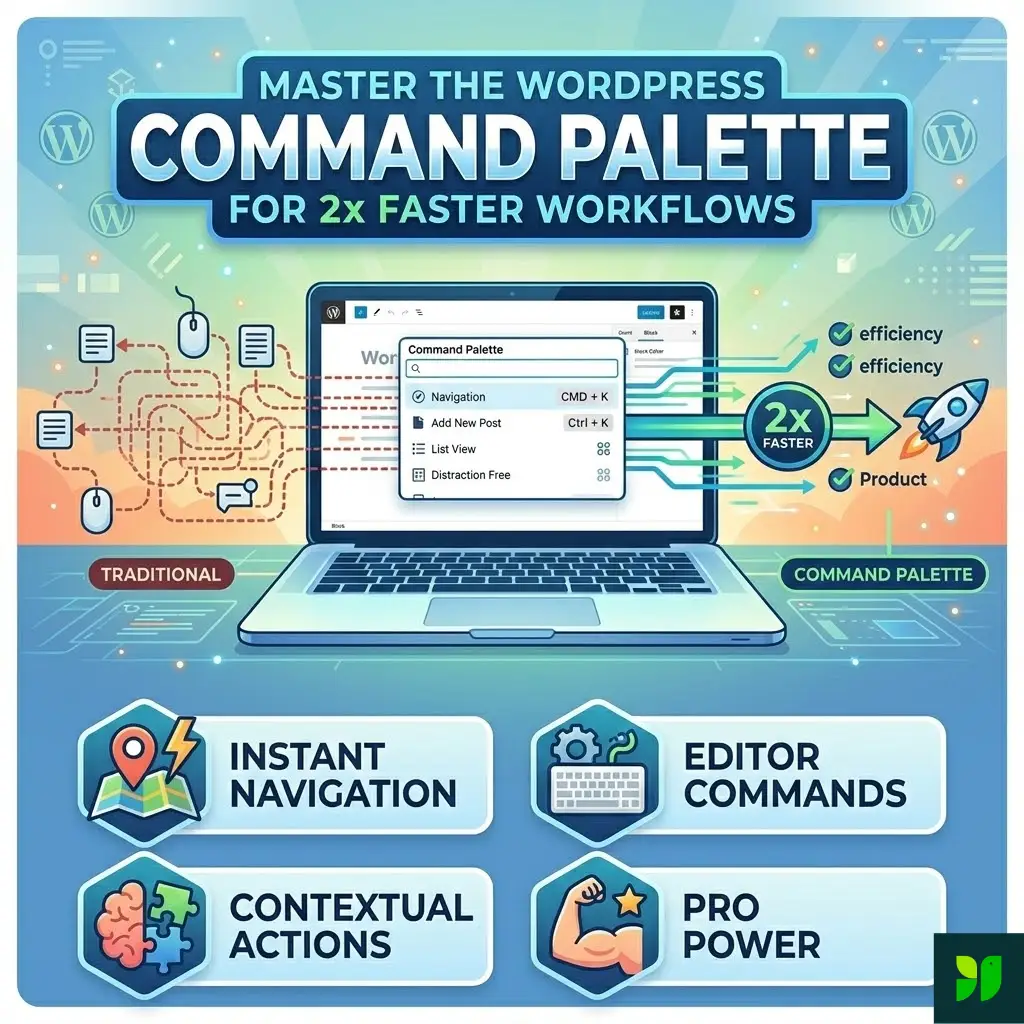
Today, we’re diving deep into the technical and psychological blueprint required to build a high-conversion checkout specifically within the WordPress and WooCommerce ecosystem.
The Psychology of Modern Checkout UX Design: Managing Cognitive Load
In 2026, UX (User Experience) isn’t just about pretty buttons or matching your brand colors, it’s about cognitive load management. Every field a customer is forced to fill out is a “tax” on their mental energy. If the tax is too high, they simply leave.
The Power of “Chunking” Information
Psychologically, humans process information better when it is “chunked.” Instead of presenting 20 fields at once, the best WooCommerce designs in 2026 use logical groupings.
- Visual Clarity and White Space: A cluttered checkout creates subconscious anxiety. By using generous white space and high-contrast typography, you guide the eye naturally from one step to the next.
- Inline Validation and Positive Reinforcement: Nothing kills momentum faster than hitting “Submit” only to be met with three red error messages. Real-time validation provides a little green checkmark the moment a user enters a valid email or zip code. This provides a hit of dopamine and confirms they are doing it “right,” keeping them moving forward.
- The “Enclosed” Checkout Environment: High-conversion stores now use a “distraction-free” checkout mode. This involves removing the main site header, footer, and social media links. Once a user is in the checkout, there should only be two paths: finish the purchase or go back to the cart.
E-commerce Checkout Optimization: Speed is Your Only Currency
We have officially entered an era where a three-second delay feels like an eternity. In 2026, optimization is synonymous with performance-first development. For a WooCommerce site, this is where the “WordPress bloat” stigma must be defeated.
Technical Performance Strategies
- Server-Side Optimization: Ensure your hosting uses Object Caching (like Redis) and high-performance stacks (like LiteSpeed). Since the checkout page is dynamic, it cannot be traditionally cached like a blog post. This means your server’s raw processing power is what matters most.
- Script Management: Many WooCommerce plugins load their scripts on every single page, including the checkout. Use a script manager to dequeue unnecessary styles and scripts that aren’t vital to the transaction process.
- Managing High-Volume Traffic: If your store experiences massive traffic spikes during sales or product launches, standard hosting won’t cut it. For a deeper dive into scaling your infrastructure, check out our comprehensive guide on high-traffic website optimization to ensure your checkout doesn’t crash when it matters most.
- The 100ms Rule: Industry data in 2026 shows that for every 100 milliseconds of latency during the checkout process, conversion rates can drop by up to 7%. Your goal should be a “Time to First Byte” (TTFB) of under 200ms on the checkout page.
The War on Cart Abandonment: Eliminating Friction Points
Cart abandonment remains the silent killer of e-commerce profits. While the average abandonment rate in 2026 still hovers around 70%, the reasons why people leave have become much more specific.
Transparency is the Best Policy
The primary culprit for mid-checkout abandonment is unexpected costs. If a user sees a $50 total in their cart but hits a $72 total at the final payment screen due to shipping and taxes, they feel deceived.
- Dynamic Shipping Calculators: Use geolocation to estimate shipping costs on the product page or within a slide-out cart drawer before they even enter the checkout flow.
- The Death of Forced Account Creation: In 2026, demanding that a first-time buyer “Create an Account” with a password and email verification before they can give you money is an outdated hurdle. Allow Guest Checkout by default. You can always present an “Account Creation” option on the “Thank You” page, where they can save their details with a single click.
Mobile Checkout: The “Thumb-First” Revolution
With over 68% of all e-commerce transactions now occurring on mobile devices, “responsive design” is no longer enough. You need to design for the Thumb Zone.
Key Mobile UX Wins for 2026:
Adaptive Keyboards: This is a small WooCommerce tweak with a massive ROI. When a user taps the “Phone Number” field, the numerical keypad should appear. When they tap “Email,” the keyboard should include the “@” and “.com” shortcuts. Reducing the number of taps is the goal.
Sticky CTA Buttons: As the user scrolls through shipping options, the “Place Order” or “Proceed” button should remain “stuck” to the bottom of the viewport. This keeps the primary action always within reach of the thumb.
Biometric Integration: Leveraging the browser’s ability to access FaceID or TouchID for payment authorization is the ultimate friction-killer. It transforms a 2-minute form-filling session into a 2-second scan.
One-Page vs. Multi-Step: The 2026 Verdict
The debate between one-page and multi-step checkouts has finally reached a conclusion in 2026: It depends on the Average Order Value (AOV).
The Case for One-Page: If you are selling low-cost, impulse-buy items (under $50), a one-page checkout is unbeatable. It minimizes the perceived effort and matches the “quick buy” mentality.
The Case for Multi-Step: For high-ticket items (luxury goods, electronics, or custom furniture), a multi-step checkout actually performs better. It breaks the process into digestible “micro-commitments.” A progress bar at the top (Shipping > Payment > Review) gives the user a sense of security and control, making the large transaction feel more manageable.
Payment UX: Localization, Acceleration, and Flexibility
In 2026, “Visa and Mastercard” are just the baseline. Payment UX is now about meeting the customer exactly where they are—both geographically and financially.
The Rise of Accelerated Checkouts
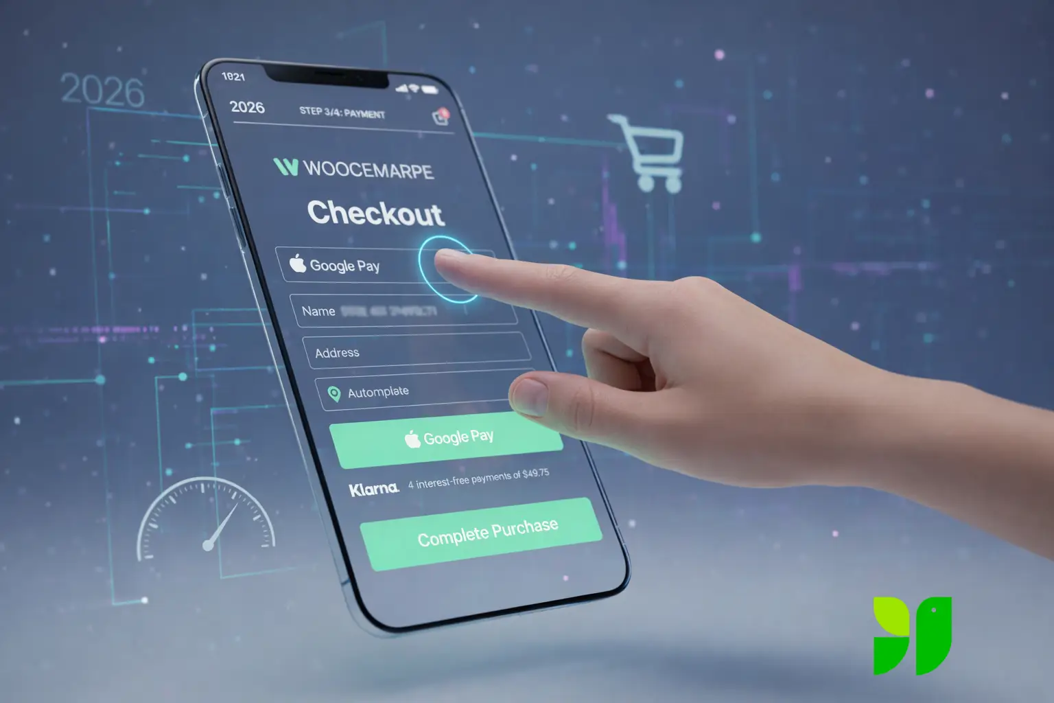
Digital Wallets like Apple Pay, Google Pay, and Link by Stripe have revolutionized conversion rates. These services allow the user to skip the entire checkout form because the shipping and billing data is already stored in the wallet. Integrating these buttons at the top of your checkout can increase conversions by 20% or more.
“Buy Now, Pay Later” (BNPL) as a Standard
Solutions like Klarna, Affirm, and Afterpay are no longer “alternative” payments; they are expected. In 2026, high-conversion stores display the “4 interest-free payments of $X” right under the total price on the checkout page. This reduces “sticker shock” and increases the Average Order Value as customers feel more comfortable spending more when the cost is spread out.
Strategic WooCommerce Optimization Tools & Plugins
WordPress offers an incredible ecosystem of tools to achieve these 2026 standards without requiring a million-dollar development budget.
Address Autocomplete (Google Places API): Integrating an address autocomplete feature is one of the highest-ROI changes you can make. It eliminates about 50% of manual typing and prevents shipping errors caused by typos.
The Floating Mini-Cart: Use a slide-out cart that allows users to adjust quantities or remove items without leaving the current page. This keeps them in the “buying loop” rather than the “loading loop.”
Smart Post-Purchase Upsells: Instead of interrupting the checkout flow with “Wait! Add this too!”, use a post-purchase upsell. Once the customer has hit “Order,” show them a one-click offer that adds to their existing order. This protects the initial conversion while boosting revenue.
The 2026 High-Conversion Checklist
To wrap up, here is a quick checklist to audit your current WooCommerce checkout:
Is Guest Checkout enabled?
Is the mobile “Place Order” button reachable by a thumb?
Do numerical keyboards pop up for phone/zip code fields?
Are shipping costs visible before the final payment step?
Is Apple/Google Pay integrated and positioned at the top?
Does the page load in under 2 seconds on a 4G connection?
Have you removed the main navigation and footer from the checkout page?
Empathy as a Growth Strategy
At the end of the day, a high-conversion WooCommerce store in 2026 isn’t just about the latest code or the shiniest plugins; it’s about empathy. It’s about respecting your customer’s time, protecting their data, and making their journey as smooth as possible.
When you remove the friction, you aren’t just “optimizing a site”—you are building trust. And in the world of e-commerce, trust is the only currency that never devalues.