In 2026, the digital landscape has moved far beyond simple aesthetics. We have entered the era of “Cognitive Design”—a period where a website isn’t just a digital brochure, but a living, breathing interactive ecosystem. It must balance lightning-fast edge computing, AI-driven accessibility, and deep human-centric empathy.
Despite these technological leaps, many businesses are still clinging to design habits from 2020. If your bounce rates are high, your “Time on Page” is dwindling, and your conversions are plummeting, you might be committing one of the “silent killers” of modern web design.
In this deep dive, we’ll explore the 10 most crucial design mistakes currently killing websites and provide the precise, future-proof strategies you need to thrive in the 2026 market.
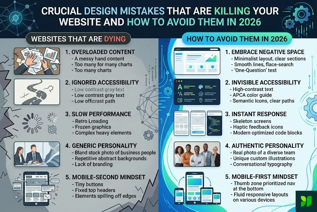
The “Information Overload” Trap: Respecting Cognitive Load
The most common mistake in 2026 is the failure to respect the “3-Second Cognitive Load.” In a world saturated with AI-generated content, users are bombarded with more information than ever before. Their “filter” for relevance has become incredibly sharp.
The Mistake:
Greeting a visitor with a hero section that contains a long paragraph, three competing buttons, a sliding banner, and a chat-bot popup all at once. This triggers “Analysis Paralysis,” where the brain instinctively hits the “back” button to find a simpler, clearer solution.
How to Avoid It in 2026:
The Power of Negative Space: White space is not “empty” space; it is a structural tool. Use it to separate ideas and guide the eye toward your most important message.
The “One-Question” Test: Every section of your homepage should answer exactly one question for the user (e.g., “What do you do?”, “Who have you helped?”, “How much does it cost?”).
Progressive Disclosure: Don’t tell them everything at once. Use “Read More” toggles or multi-step interactions to reveal information only when the user asks for it.
Ignoring “Invisible” Accessibility (A11y)
In 2026, accessibility is no longer just a “nice-to-have” or a legal checkbox; it is a core SEO ranking factor. Search engines now prioritize sites that provide an equitable experience for all users.
The Mistake:
Focusing only on “Screen Readers” while ignoring the needs of users with neurodivergence, temporary disabilities (like a broken arm), or situational limitations (like using a phone in direct sunlight). Low-contrast text and “Mystery Meat Navigation” (icons without labels) are the primary offenders here.
How to Avoid It in 2026:
APCA Contrast Standards: Move beyond the old WCAG 2.1 ratios. Use the Advanced Perceptual Contrast Algorithm (APCA), which accounts for how the human eye actually perceives color on high-resolution displays.
Focus States: Ensure that every interactive element has a clear, high-contrast “Focus” ring for keyboard users.
Alt-Text as Context: Don’t just write “Image of a laptop.” Write “A professional using our software to analyze 2026 market trends.” Provide the why, not just the what.
Passive Performance: The “Perceived Speed” Fallacy
We used to talk about “Loading Speed.” In 2026, we talk about “Instant Response.” Users no longer tolerate the “loading spinner.” If a user clicks a button and there isn’t an immediate visual confirmation, they assume the site is broken.
The Mistake:
Relying on heavy, legacy JavaScript frameworks that might load “fast enough” on a 6G fiber connection but fail miserably for a mobile user on a congested network.
How to Avoid It in 2026:
Skeleton Screens: Instead of a spinning wheel, use skeleton screens (gray placeholders that mimic the layout of the content). This makes the load feel faster because the layout is already visible.
Zero-Runtime CSS: Shift toward modern CSS solutions like Tailwind 5.0 or CSS-in-JS that compile away, leaving the browser with nothing to do but render the pixels.
Haptic & Visual Feedback: Every “Tap” should result in a change—a color shift, a slight movement, or a micro-animation—within 100 milliseconds.
Generic “AI Stock” Personality: The Trust Deficit
With the explosion of AI-generated imagery, the internet has become flooded with “perfect but soulless” visuals. A major design mistake killing conversions is the use of generic, Midjourney-style stock photos that look like everyone else’s.
The Mistake:
Using “Business People Shaking Hands” or “Abstract Blue Technology Lines.” Users in 2026 are hyper-sensitive to “fake” imagery. If your visuals look like a prompt, users assume your brand is a facade.
How to Avoid It in 2026:
Lofi Authenticity: Imperfect, real-world photos of your actual team, your messy office, or your physical product out in the wild outperform “perfect” AI renders by a factor of 3 to 1.
Hand-Drawn Brand Assets: Use custom-drawn icons or illustrations that have human “imperfections.” This signals that there are real people behind the screen.
Founder-Led Design: Include video snippets or personal notes from the leadership. In an AI world, Human Connection is the ultimate premium product.
The “Mobile-Second” Mindset
Even though “Mobile-First” has been a mantra for a decade, many designers still build on a 32-inch monitor and simply “shrink” the design for mobile. In 2026, mobile devices are the primary (and often only) computing platform for the vast majority of your audience.
The Mistake:
Tiny “touch targets” (buttons placed too close together) and fixed-height headers that consume 40% of a vertical phone screen.
How to Avoid It in 2026:
The Thumb Zone: Place your most critical navigation (Home, Search, Cart) at the bottom of the screen. This is where the user’s thumb naturally rests.
Fluid Typography: Use the CSS
clamp()function. Your text should scale smoothly from a tiny smartwatch to a massive foldable phone without any “break-points” feeling awkward.Eliminate Hover: Designing an interaction that requires a “hover” state is a death sentence. All interactions must be “Tap,” “Swipe,” or “Long-Press” native.
Dark Mode as an Afterthought
By 2026, over 85% of mobile users have their system settings set to “Dark Mode.” A website that forces a bright white screen at 11:00 PM is a website that gets closed immediately.
The Mistake:
Simply “inverting” colors. This often leads to neon-blue text on a jet-black background, which causes “halatuation” (a vibrating effect that strains the eyes).
How to Avoid It in 2026:
Layered Grays over Pure Black: Use very dark grays (
#121212) for the base background. This allows you to use shadows to create depth, which is impossible on pure black.Desaturated Brand Colors: Bright primary colors that look great on white look “electric” on dark backgrounds. Create a “Dark Palette” that desaturates your brand colors by 20% for better legibility.
Auto-Switching: Use the
prefers-color-schememedia query to respect the user’s system settings without them having to click a toggle.
Aggressive Interruption: The Death of the Pop-up
The full-screen pop-up that appears 3 seconds after a page loads is the #1 reason for “instant bounce” in 2026. Users are more protective of their “Flow State” than ever.
The Mistake:
Interrupting a user who is trying to read your content to ask for their email address before you have provided a single penny of value.
How to Avoid It in 2026:
Contextual Inline CTAs: Instead of a pop-up, place a beautifully designed signup box right in the middle of your article, related to the specific paragraph the user just read.
Slide-ins and Toasts: Use non-blocking elements that appear in the corner of the screen. They should be dismissible with a simple swipe.
Exit-Intent with a Gift: Only trigger a pop-up when the user’s cursor moves toward the “Close Tab” button, and make sure you are offering something truly valuable (like a 20% discount or an AI tool).
Failure to Design for “AI Agents” and Voice Search
In 2026, many people don’t “visit” your site manually. They ask their AI personal assistant (like Gemini or Siri) to find information from your site.
The Mistake:
Hiding your most important data (pricing, hours, location, or features) inside images, complex sliders, or “fancy” JavaScript widgets that an AI crawler cannot easily parse.
How to Avoid It in 2026:
Schema Markup (JSON-LD): This is the “hidden design” of your site. Ensure your backend tells AI exactly what your product is and what it costs.
Conversational Structure: Design a “Fast Facts” or “FAQ” section that uses natural language. Instead of “Shipping Policy,” use the heading “How long does shipping take?”
Plain Text over Graphics: If it’s a number or a fact, it should be in HTML text, not a graphic.
Lack of Ethical Privacy Design (Dark Patterns)
Privacy is no longer just a legal page hidden in the footer. In 2026, “Privacy-First Design” is a competitive advantage that builds brand loyalty.
The Mistake:
Using “Dark Patterns”—design tricks that make it hard to opt-out of cookies, hide the “Unsubscribe” button in a tiny font, or use confusing language like “Check this box to NOT receive emails.”
How to Avoid It in 2026:
Transparent Permissions: When you ask for a user’s location, explain why in a friendly micro-copy (e.g., “We need your location to show you the nearest pickup point”).
The “Easy-Exit” Design: Make it as easy to cancel a subscription as it was to sign up. It sounds counter-intuitive, but this creates “Word of Mouth” trust that is worth more than a forced subscription.
Privacy Nutrition Labels: Summarize your data usage in a simple, visual chart that a 10-year-old could understand.
The “Static” Content Mistake: Ignoring Personalization
A website that looks the same for a first-time visitor and a 5-year loyal customer is a missed opportunity in 2026.
The Mistake:
Serving generic “one-size-fits-all” content. This makes your brand feel cold and out of touch with the user’s specific needs.
How to Avoid It in 2026:
Dynamic Hero Sections: If a user came from a “Real Estate” ad, your hero section should mention real estate. If they came from “E-commerce,” it should reflect that.
“Recently Viewed” Blocks: Borrow from the Amazon playbook. Help users find their way back to what they were looking at previously.
User-Defined Layouts: Allow users to choose their “View” (e.g., List view vs. Grid view). Empowering the user to control the design is a hallmark of high-end 2026 UX.
Conclusion: The 2026 Design Audit
Web design is no longer about “decoration.” It is about Communication, Speed, and Trust. If you avoid these ten mistakes, you aren’t just making a “pretty” website—you are building a functional business asset that respects the user’s time, attention, and privacy.
The websites that thrive in this decade will be those that prioritize the Human Experience over the Design Trend.
Your 2026 Action Plan:
Audit your Speed: Does the site respond to a tap in under 100ms?
Audit your Trust: Are you using real photos or generic AI stock?
Audit your Accessibility: Does it pass APCA contrast standards?
Audit your Mobile: Can you navigate the entire site using only your thumb?